New Tshirt Closeups
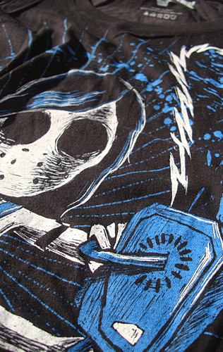
The detail and 'softness' of these new prints is unreal. I reworked a lot if not all the designs with some minor tweaks (or major depending on the image) here and there to take advantage of the availability of preciseness to detail. We've also been able to take advantage of adding colours to our pallet which we couldn't do when we were printing ourselves. You can see the brightness and vibrancy of the colours in the new Butcher, and just how fine the detail is on I Fear.


The new Tokyo Revenge really shows where I modified the image with the added rays in the burst behind her, and a fresher electric blue. The Ripper was almost completely redrawn as the original design was done back when we were making our own screens, and when I was just starting to work with this scratch style. The hand had to be broken off and done over from scratch, and all the shadows had to be rebuilt. Even the pattern was reimported to work against the new shadows. An then finally we went with a really nice cream/beige colour instead of the original gold print just to remain relevant with the rest of our brand.


The new Tokyo Revenge really shows where I modified the image with the added rays in the burst behind her, and a fresher electric blue. The Ripper was almost completely redrawn as the original design was done back when we were making our own screens, and when I was just starting to work with this scratch style. The hand had to be broken off and done over from scratch, and all the shadows had to be rebuilt. Even the pattern was reimported to work against the new shadows. An then finally we went with a really nice cream/beige colour instead of the original gold print just to remain relevant with the rest of our brand.


